Grid Lines
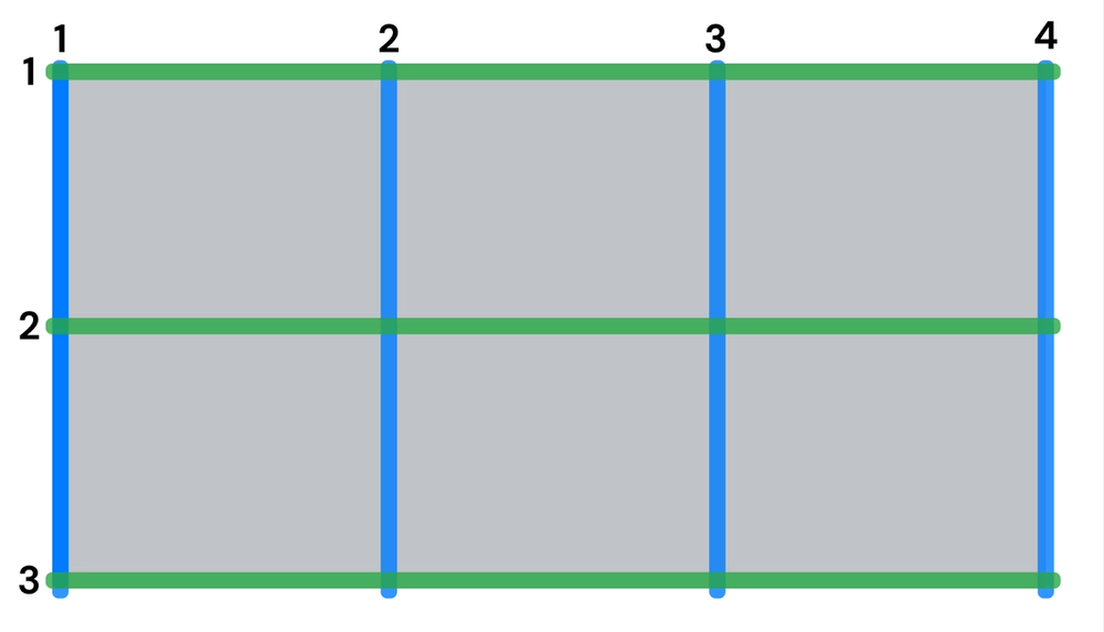
Grid items can be arranged inside the grid container to start and end wherever you specify, and cover more than one cell. CSS grid lines are hypothetical lines between rows and columns, numbered starting from 1.
Specifying Columns and Rows
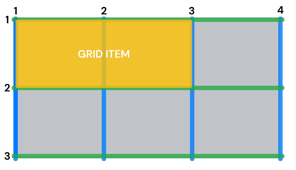
Use the grid-column property to specify the vertical start and end line of an item, referring to the picture above. Use grid-row to control the horizontal start and end lines. For example, if you want an item to span two columns and stay only on the first row, it would look like this:
#one {
    grid-column: 1 / 3;
    grid-row: 1 / 2;
}
Grid-area
The grid-area property combines grid-column and grid-row like this: grid-area: row start / column start / row end / column end. The example above can be rewritten as grid-area: 1 / 1 / 1 / 3;
In addition, instead of writing where the column or row ends, we can write how many columns/rows the item spans. If, for example, you want the next item to take up the third column of each of the two rows, you can write it like this:
#two {
    grid-area: 1 / 3 / span 2 / span 1;
}
And here's the first example written in the same format: grid-area: 1 / 1 / span 1 / span 2.