For this project, you will be making a CSS grid gallery. Try to use as much of what you learned so far as you can - here's an example:
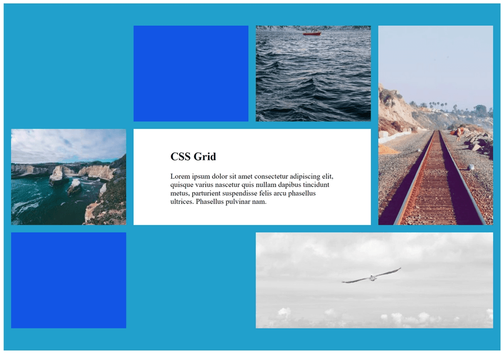
Feel free to be creative with your own grid. The solution shows the code for the example above.
CSS · Chapter 4: Grid
Use what you learned about grids to make a picture gallery
For this project, you will be making a CSS grid gallery. Try to use as much of what you learned so far as you can - here's an example:
Feel free to be creative with your own grid. The solution shows the code for the example above.
First, make an outline for the grid in HTML using <div> elements. There should be one large div for the grid as a whole and individual divs for each element.
HTML:
<!DOCTYPE html>
<html lang="en">
<head>
    <meta charset="UTF-8">
    <meta http-equiv="X-UA-Compatible" content="IE=edge">
    <meta name="viewport" content="width=device-width, initial-scale=1.0">
    <title>Grid Gallery</title>
    <link rel="stylesheet" href="styles.css">
</head>
<body>
    <div class="container-fluid" id="cssgrid">
        <div class="grid-container">
            <div id="item1"><img src="https://picsum.photos/id/1038/300/200" alt="waves"></div>
            <div id="item2"><img src="https://picsum.photos/id/1050/300/200" alt="ocean coastline"></div>
            <div id="item3">
            <div>
                <h2>CSS Grid</h2>
                <p>Lorem ipsum dolor sit amet consectetur adipiscing elit, quisque varius nascetur quis nullam dapibus tincidunt metus, parturient suspendisse felis arcu phasellus ultrices. Phasellus pulvinar nam.</p></div>
            </div>
            <div id="item4"><img src="https://picsum.photos/id/130/800/500" alt="grayscale seagull"> </div>
            <div id="item5"></div>
            <div id="item6"><img src="https://picsum.photos/id/155/800/500" alt="grayscale seagull"> </div>
            <div id="item7"></div>
        </div>
    </div>
</body>
</html>
CSS:
#item1 {
    grid-area: 1/3/2/4;
}
#item2{
    grid-area: 2/1/3/2;
}
#item3 {
    grid-area: 2/2/3/4;
    display: flex;
    align-items: center;
    background-color: #ffffff;
    padding: 5em;
    color: #000000;
}
#item4 {
    grid-area: 3/3/4/5;
}
#item5 {
    grid-area: 1/2/2/3;
    background-color: #1255e5;
}
#item6 {
    grid-area: 1/4/3/5;
}
#item7 {
    grid-area: 3/1/4/2;
    background-color: #1255e5;
}
.grid-container {
    display: grid;
    grid-template-columns: 1fr 1fr 1fr 1fr ;
    grid-template-rows: 35vh 35vh 35vh;
    background-color: #21a0cb;
    grid-gap: 1em;
    padding: 3em 1em;
}

.grid-container img {
    height: 100%;
    width: 100%;
    object-fit: cover;
    display: block;
}
Give the project a try first.